Major axis regression
‘ggpmisc’ 1.0.0.9000
Pedro J. Aphalo
2026-07-08
Source:vignettes/articles/major-axis-regression.Rmd
major-axis-regression.RmdAims of ‘ggpmisc’ and caveats
Package ‘ggpmisc’ makes it easier to add to plots created using ‘ggplot2’ annotations based on fitted models and other statistics. It does this by wrapping existing model fit and other functions from base R and various R packages. The same annotations can be produced by calling the model fit functions, extracting the desired estimates and adding them to plots. There are two advantages in wrapping these functions in an extension to package ‘ggplot2’: 1) it ensures the coupling of graphical elements and the annotations by building all elements of the plot using the same data and a consistent grammar and 2) it makes it easier to annotate plots to the casual user of R, already familiar with the grammar of graphics.
To avoid confusion it is good to make clear what may seem obvious to some: if no plot is needed, then there is no reason to use this package. The values shown as annotations are not computed by ‘ggpmisc’ but instead by the usual model-fit and statistical functions from R and other packages. The same is true for model predictions, residuals, etc. that some of the functions in ‘ggpmisc’ display as lines, segments, or other graphical elements.
It is also important to remember that in most cases data analysis including exploratory and other stages should take place before annotated plots for publication are produced. Even though data analysis can benefit from combined numerical and graphical representation of the results, the use I envision for ‘ggpmisc’ is mainly for the production of plots for publication or communication. In any case, whether plots created with functions and methods from ‘ggpmisc’ are used for analysis or communication, it is crucial that users cite and refer both to ‘ggpmisc’ and to the underlying R and R packages used to fit models or to do other statistical computations.
Introduction
Warton et al. (2006) provides a gentle introduction to Major Axis (MA), Standardized Major Axis (SMA) and related regression methods, including criteria that help select among MA, SMA, and OLS methods for linear regression. It is advisable that users unfamiliar with these methods read this article before attempting their use as the decision about their use is not always straightforward.
It is important to remember that linear regressions fitted with these methods do not differ in the amount of variation explained (R^2) or its significance (P-value) from those fitted by OLS. Only the estimate of the slope is affected.
The examples below rely on packages ‘lmodel2’ and ‘smatr’ for fitting the models, and the documentation of these packages should be consulted in relation to the model fitting functions. However, not all features of these packages or of the functions defined in them, can be used through ‘ggpmisc’.
Reference:
Warton DI, Wright IJ, Falster DS, Westoby M. (2006) Bivariate line‐fitting methods for allometry. Biological Reviews 81, 259–291.
Preliminaries
We load all the packages used in the examples.
Attaching package ‘ggpmisc’ also attaches package ‘ggpp’ as it provides several of the geometries used by default in the statistics described below. Package ‘ggpp’ can be loaded and attached on its own, and has separate documentation.
As we will use text and labels on the plotting area we change the default theme to an uncluttered one.
We generate artificial data to use in examples. Here x0
is a deterministic sequence of integers in 1
\ldots 100 and both x and y are derived
from it by adding Normally distributed “noise” with mean zero and
standard deviation 20. Thus, the expected slope is equal to 1.
yg has a deterministic difference of 10 between groups
A and B.
When and why use major axis regression
In ordinary least squares and some other approaches the assumptions about the measuring errors for x and y differ. The assumption is that x is measured without or with so small error, that measurement error can be safely attributed in whole to y. This does not mean that X is necessarily free of variation, but instead that we know without error the x value for each observation event. This situation is frequently, but not always, true for manipulative experiments where x is an independent variable controlled by the researcher.
When this assumption is not fulfilled the parameter estimates become biased. When R^2 \approx 1 the error is small, but the error increases rapidly as R^2 for a fit decreases. In the example below, R^2 > 0.8 but nontheless bias is obvious.
To demonstrate how OLS assumptions about x and y
affect a linear regression fit, the next figure shows fits to the same
data with formula y ~ x and x ~ y. Swapping
dependent (response) and independent (explanatory) variables.
ggplot(my.data, aes(x, y)) +
  geom_point() +
  stat_poly_line(formula = y ~ x,
                 color = "blue") +
  stat_poly_eq(mapping = use_label("eq", "R2", "n", "P"),
               color = "blue") +
  stat_poly_line(formula = y ~ x,
                 color = "red",
                 orientation = "y") +
  stat_poly_eq(mapping = use_label("eq", "R2", "n", "P"),
               color = "red",
               orientation = "y",
               label.y = 0.9)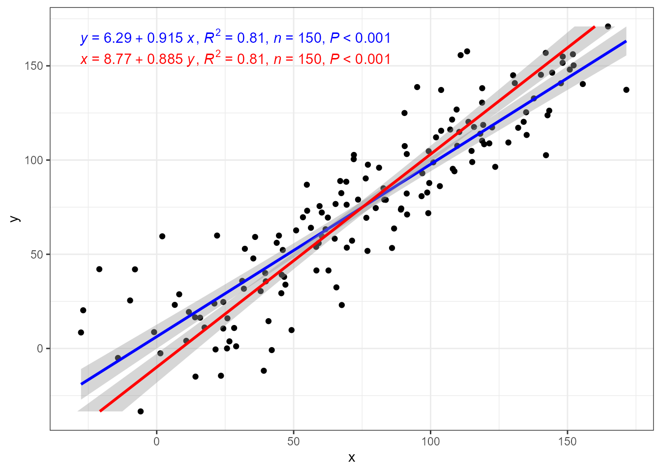
A different assumption is that both x and y are subjected to measurement errors of similar magnitude, which is usually the case in allometric models describing the size relationship between the different organs or parts of an organism. Other similar situation is the study of chemical composition and comparison of measurements from sensors of similar accuracy. This is where major axis (MA) regression should be used instead of OLS approaches. When both variables are subject to measurements errors but the size of the errors differ one of two variations on MA can be used: SMA, where MA is applied to standardized rather than original data, so as to equalise the variation in the data input to MA, or RMA, where the correction is based on the range of x and y values. One limitation is that MA. SMA, and RMA can be used only to fit linear relationships between variables. In some cases grouping factors are also supported.
‘lmodel2’ in stat_ma_eq() and stat_ma_line()
print(citation(package = "lmodel2", auto = TRUE), bibtex = FALSE)
#> To cite package 'lmodel2' in publications use:
#>
#>   Legendre P (2024). _lmodel2: Model II Regression_.
#>   doi:10.32614/CRAN.package.lmodel2
#>   <https://doi.org/10.32614/CRAN.package.lmodel2>. R package version
#>   1.7-4, <https://CRAN.R-project.org/package=lmodel2>.
Package ‘lmodel2’ implements Model II fits for major axis (MA), standardised major axis (SMA) and ranged major axis (RMA) regression for linear relationships. These approaches to regression are used when both variables are subject to measurement errors and the intention is not to estimate y from x but instead to describe the slope of the relationship between them. A typical example in biology are allometric relationships. Rather frequently, OLS linear model fits are used in cases where Model II regression would be preferable. In addition to lack of knowledge, lack of software support is behind this problem.
In the figure above we saw that the ordinary least squares (OLS) linear regression of y on x and x on y differ. Major axis regression provides an estimate of the slope that is independent of the direction of prediction, x \to y or y \to x, while the estimate of R^2 remains the same in all three model fits.
The prediction bands computed by package ‘lmodel2’ only consider the standard error of the estimate of the slope. They ignore the error in the estimation of the intercept. Package ‘smatr’ has the same limitation. In either case bootstraping could be used. P-values for the parameters estimates are obtained using permutations.
ggplot(my.data, aes(x, y)) +
  geom_point() +
  stat_ma_line() +
  stat_ma_eq(mapping = use_label("eq", "R2", "n", "P"))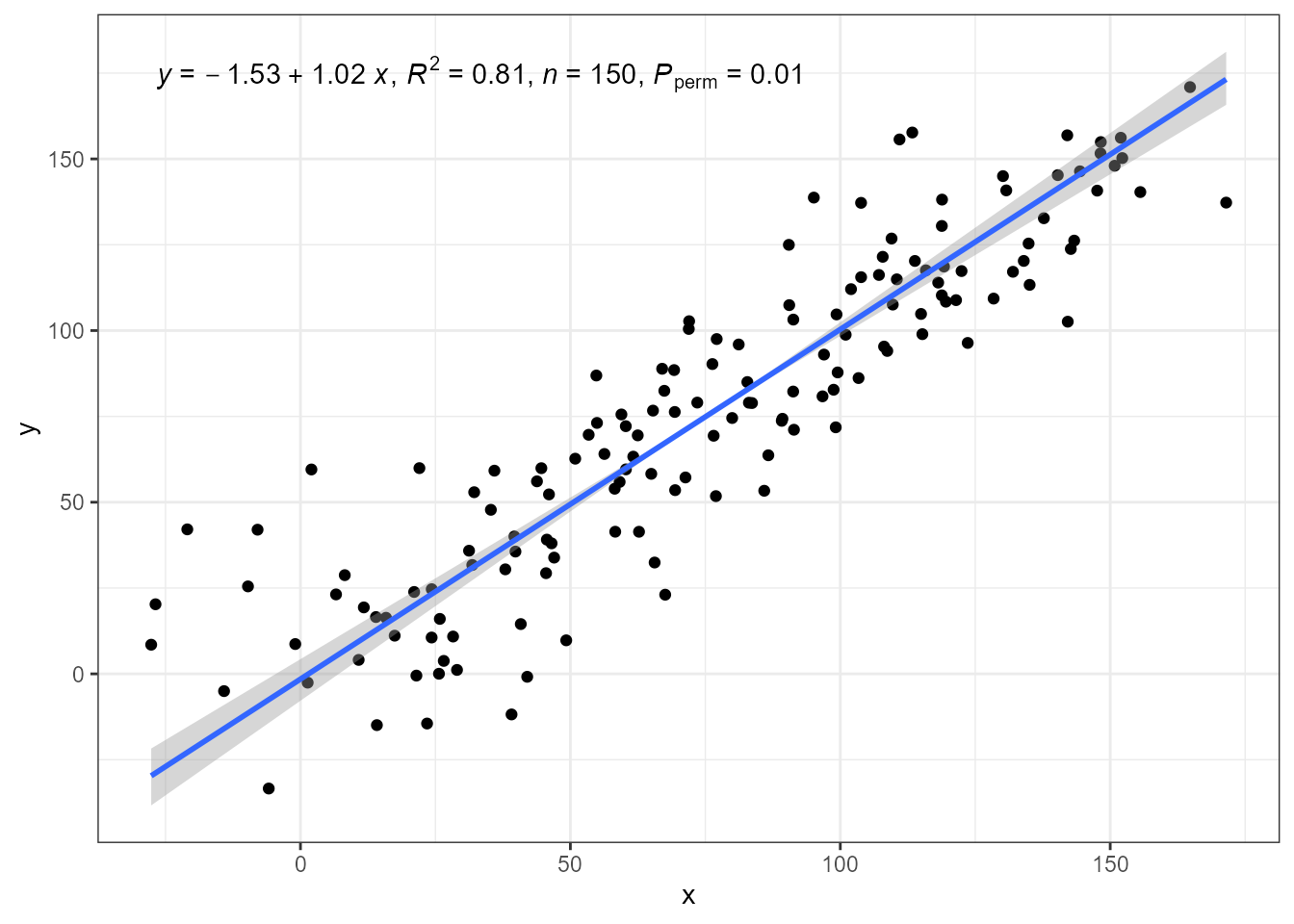
In the case of major axis regression while the coefficient estimates in the equation change, they correspond to exactly the same line.
ggplot(my.data, aes(x, y)) +
  geom_point() +
  stat_ma_line(color = "blue") +
  stat_ma_eq(mapping = use_label("eq", "R2", "n", "P"),
             color = "blue") +
  stat_ma_line(color = "red",
               orientation = "y",
               linetype = "dashed") +
  stat_ma_eq(mapping = use_label("eq", "R2", "n", "P"),
             color = "red",
             orientation = "y",
             label.y = 0.9)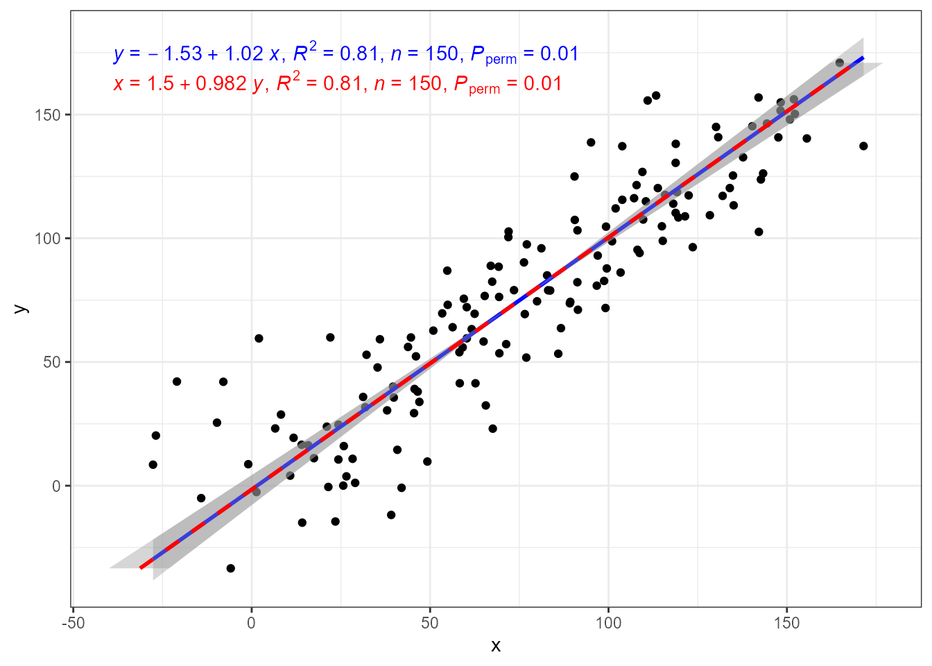
The data contain two groups of fake observations and factor
group as group id. In ‘ggplot2’ most statistics apply
computations by group, not by panel. Grouping as shown bellow is handled
by fitting the model once for each group after partitioning the data
based on the levels of the grouping variable.
ggplot(my.data, aes(x, yg, colour = group)) +
  geom_point() +
  stat_ma_line() +
  stat_ma_eq(mapping = use_label("eq", "R2", "n", "P"))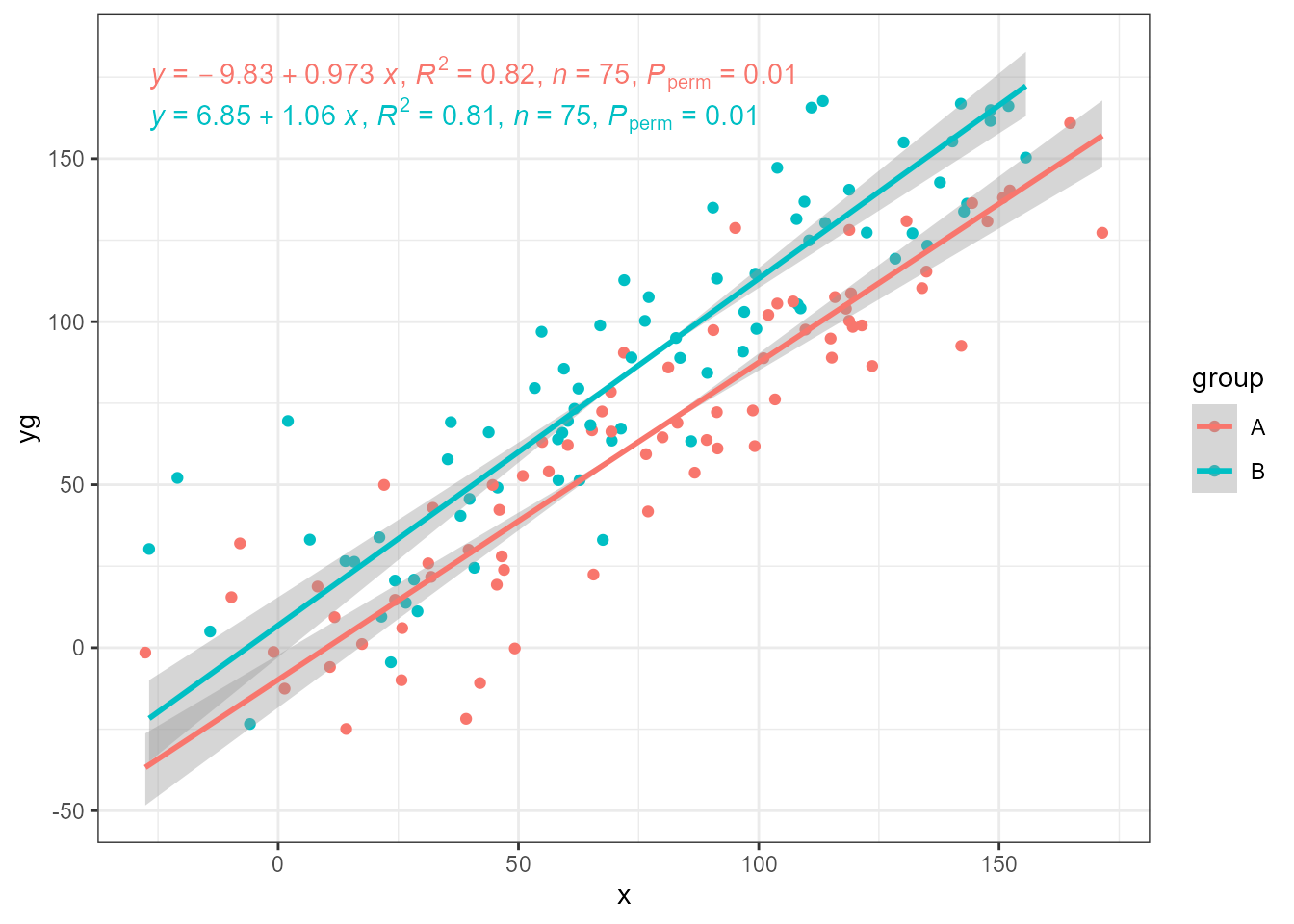
SMA and RMA
While major axis (MA) regression takes the observations as is, standardised major axis (SMA) regression and ranged major axis (RMA) regression scale them to balance the error on x and y. SMA uses SD while RMA uses the range or interval of the values in each variable. The next three plots use as input the same response variable as above but multiplied by 100. With MA, the lines expected to be parallel based on how the artificial data was generated, are not.
ggplot(my.data, aes(x, yg * 100, colour = group)) +
  geom_point() +
  stat_ma_line(method = "MA") +
  stat_ma_eq(method = "SMA",
             mapping = use_label("eq", "R2", "n", "P"))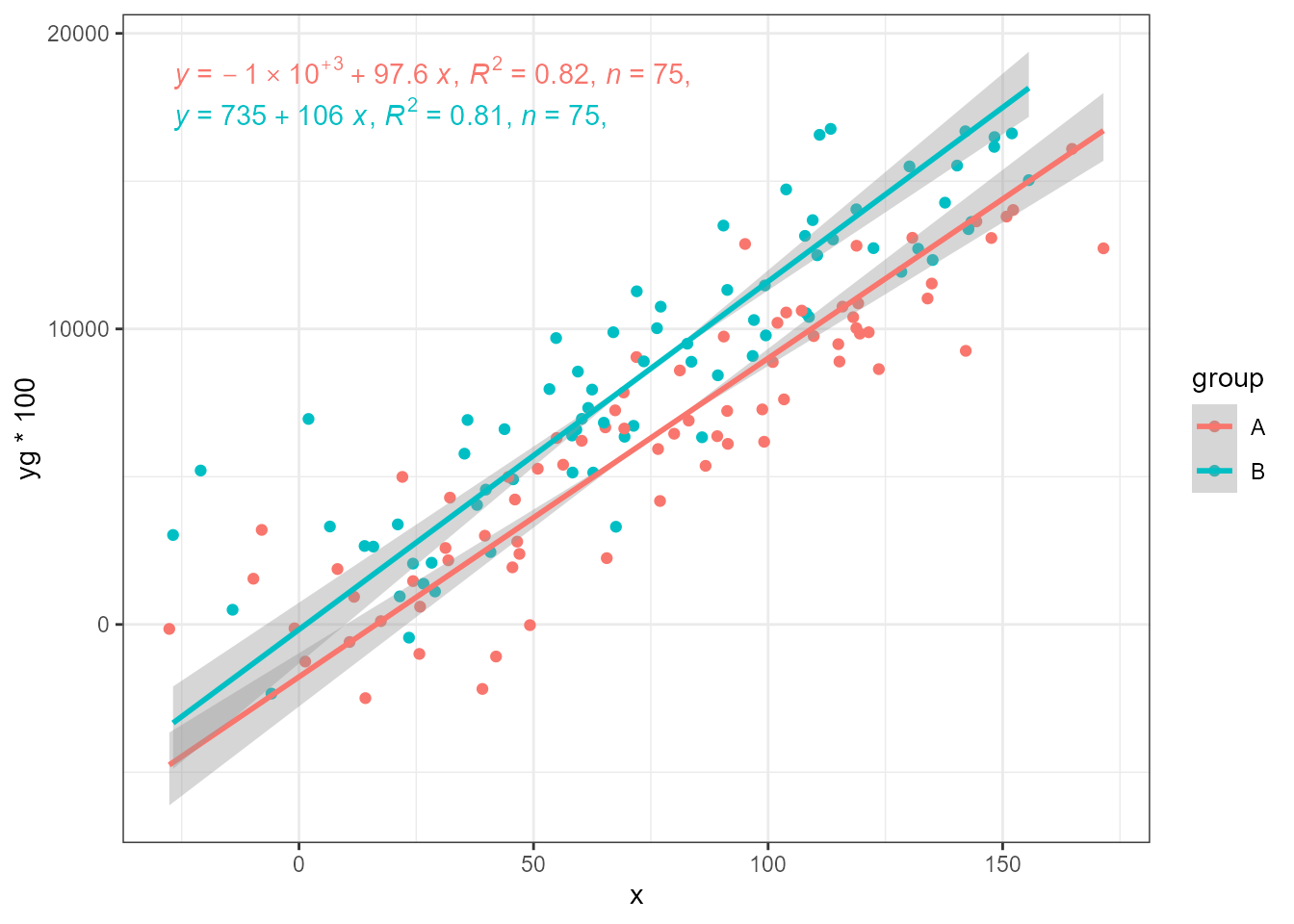
SMA and RMA restore the estimates to that expected. Here SMA is the most effective, when using defaults.
ggplot(my.data, aes(x, yg * 100, colour = group)) +
  geom_point() +
  stat_ma_line(method = "SMA") +
  stat_ma_eq(method = "SMA",
             mapping = use_label("eq", "R2", "n", "P"))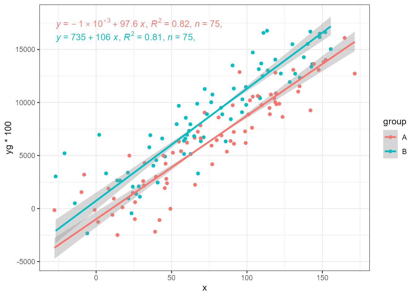
ggplot(my.data, aes(x, yg * 100, colour = group)) +
  geom_point() +
  stat_ma_line(method = "RMA",
               range.x = "interval", range.y = "interval") +
  stat_ma_eq(method = "RMA",
             range.x = "interval", range.y = "interval",
             mapping = use_label("eq", "R2", "n", "P"))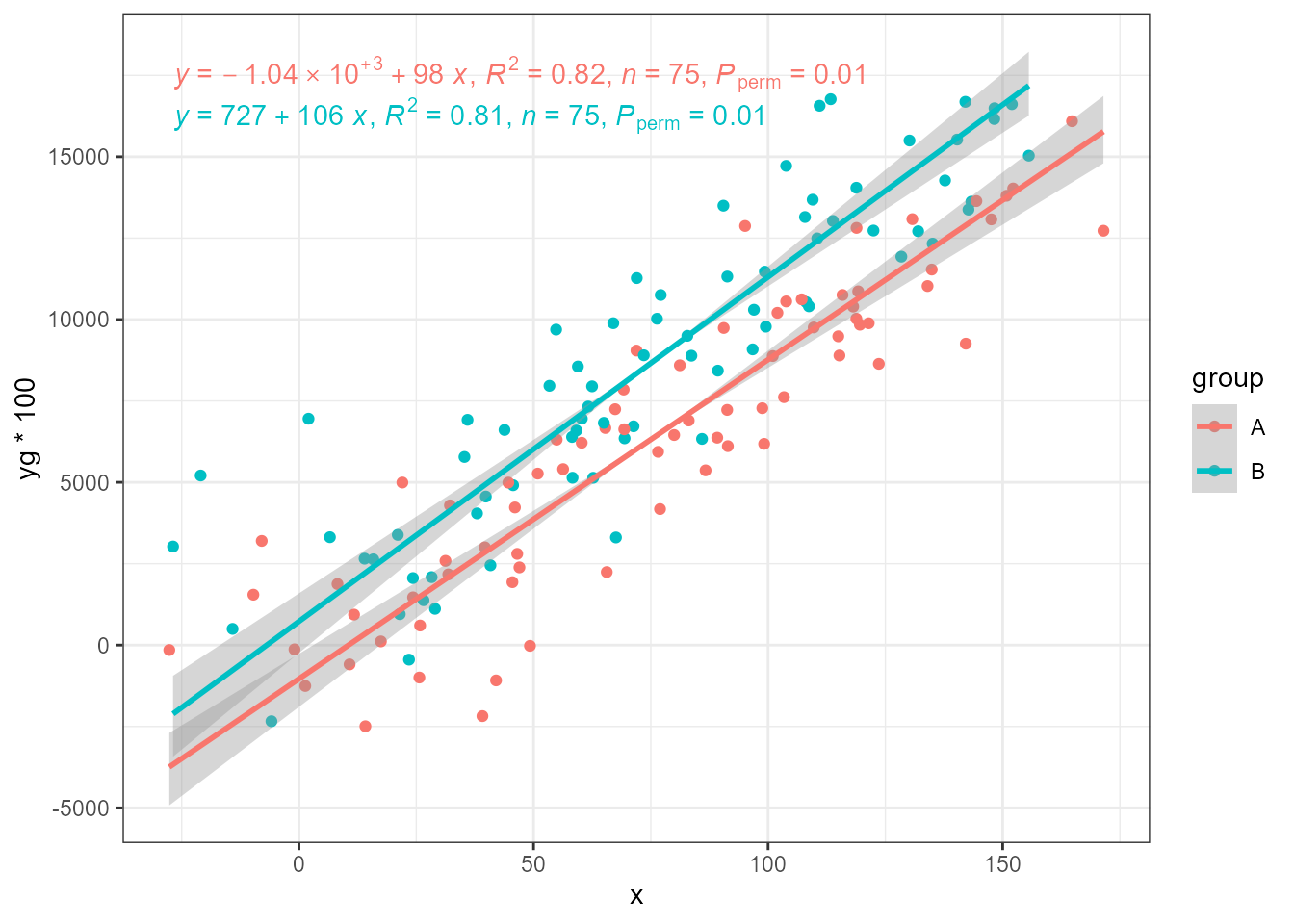
The generated data also contain variable y2 with the
same mean as y with but increased random variation (\sigma_x = 20 and \sigma_x = 30).
ggplot(my.data, aes(x, yg2, colour = group)) +
  geom_point() +
  stat_ma_line(method = "MA") +
  stat_ma_eq(method = "MA",
             mapping = use_label("eq", "R2", "n", "P"))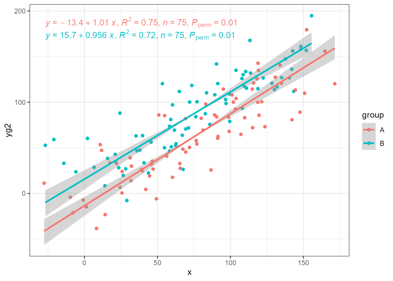
ggplot(my.data, aes(x, yg2, colour = group)) +
  geom_point() +
  stat_ma_line(method = "SMA") +
  stat_ma_eq(method = "SMA",
             mapping = use_label("eq", "R2", "n", "P"))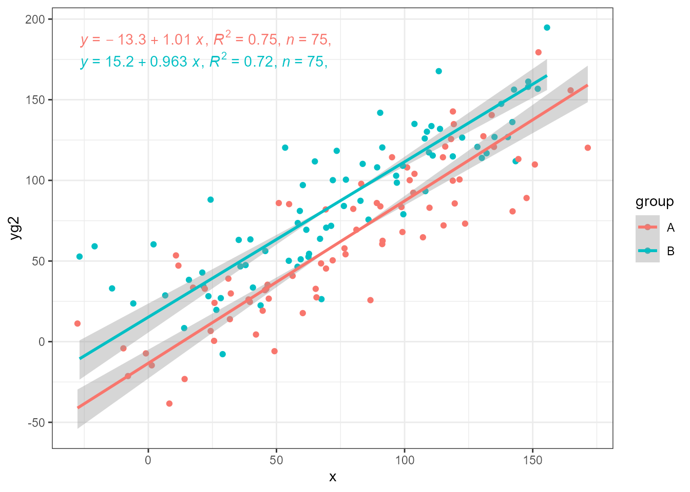
These statistics can also fit the same model by OLS, which demonstrates the strong bias in the slope estimate as from how we constructed the data applying equal normally distributed pseudo random variation to both x and y we know the “true” slope is equal to 1. Even with R^2 > 0.7, and more than 70% of the variation in y explained by x, slopes are noticeably biased towards being shalower.
ggplot(my.data, aes(x, yg2, colour = group)) +
  geom_point() +
  stat_ma_line(method = "OLS") +
  stat_ma_eq(method = "OLS",
             mapping = use_label("eq", "R2", "n", "P"))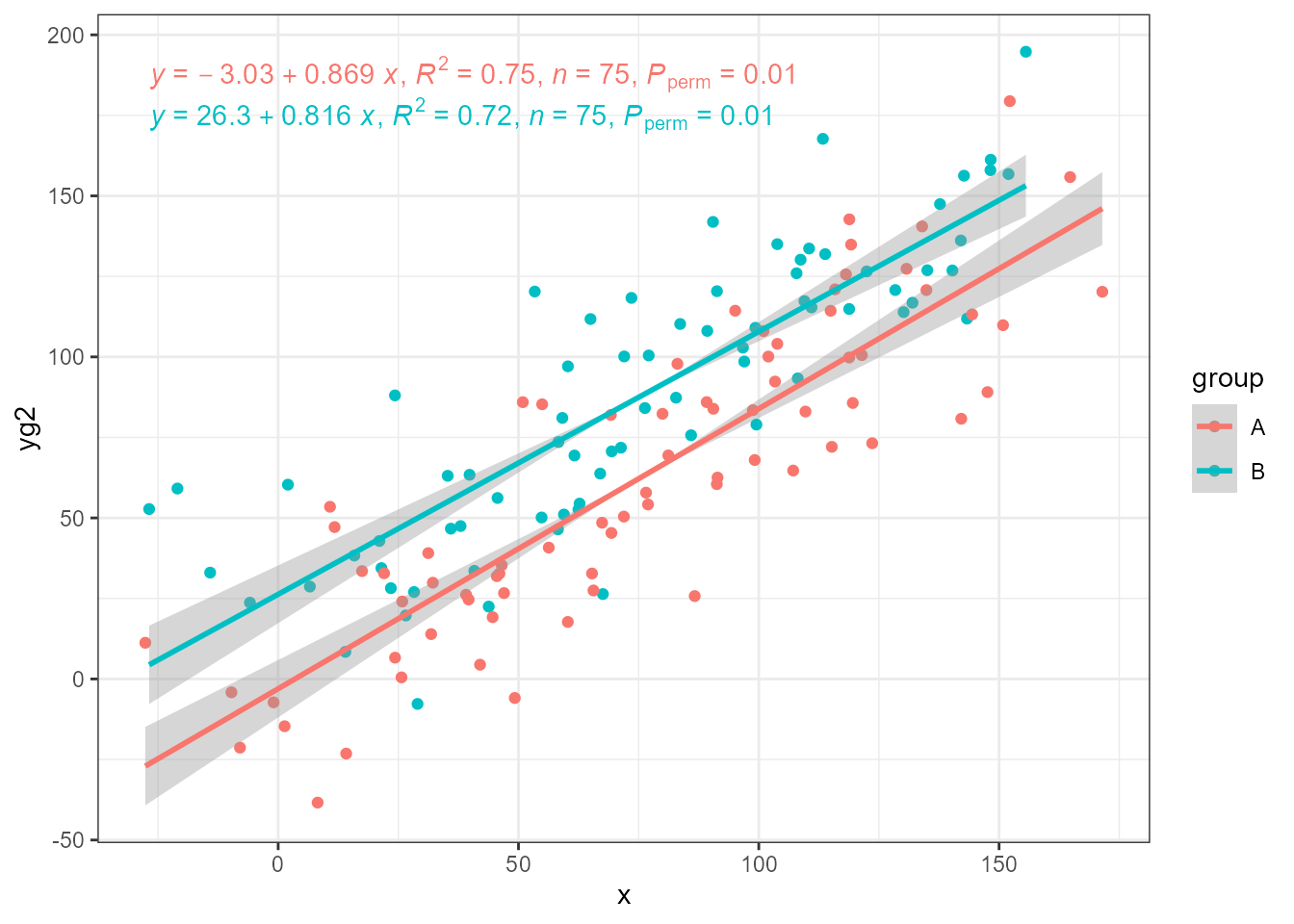
In our data x0 has no random variation added, and using
it we get the expected unbiased estimates using OLS.
ggplot(my.data, aes(x0, yg2, colour = group)) +
  geom_point() +
  stat_ma_line(method = "OLS") +
  stat_ma_eq(method = "OLS",
             mapping = use_label("eq", "R2", "n", "P"))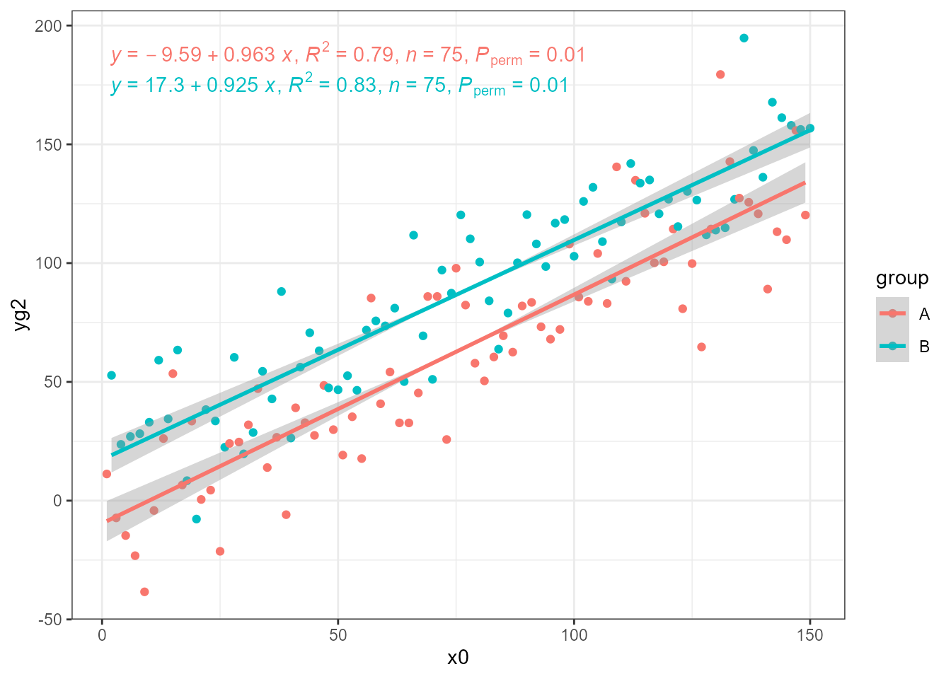
‘smatr’ with stat_poly_eq() and stat_poly_line()
print(citation(package = "smatr", auto = TRUE), bibtex = FALSE)
#> To cite package 'smatr' in publications use:
#>
#>   Warton D, Duursma R, Falster D, Taskinen. S (2018). _smatr:
#>   (Standardised) Major Axis Estimation and Testing Routines_.
#>   doi:10.32614/CRAN.package.smatr
#>   <https://doi.org/10.32614/CRAN.package.smatr>. R package version
#>   3.4-8, <https://CRAN.R-project.org/package=smatr>.
#>
#> ATTENTION: This citation information has been auto-generated from the
#> package DESCRIPTION file and may need manual editing, see
#> 'help("citation")'.
The functions for major axis regression from package ‘smatr’ behave
similarly to lm and other R model fit functions and
accessors to the components of the model fit object are available.
However, summary.sma() prints a summary and returns
NULL and predict.sma() displays a message and
returns NULL. Calls to these methods are skipped, and as
fitted() does not return values in data units they are
computed using the fitted coefficients. The confidence band for is not
currently available, the band displayed is for the uncertainty of the
slope.
The differences in the model fit object are small enough to be worked
around them stat_poly_eq() and
stat_poly_line(). Just remember that only model formulas
for a straight line can be used.
ggplot(my.data, aes(x, y)) +
  geom_point() +
  stat_poly_line(method = "ma") +
  stat_poly_eq(method = "ma",
             mapping = use_label("eq", "R2", "P", "AIC", "BIC")) +
  expand_limits(y = 150)
#> SMA/MA, band is currently for slope only!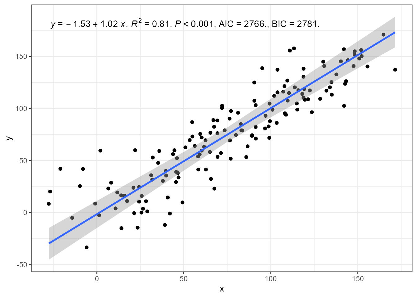
Plotting of fitted values, deviations and residuals is not
implemented for "ma".
A log10 transformation applied by passing a named argument to the model fit function creates a mismatch between the scale of the plot and fitted model equation in annotations! The equation must be manually altered as done below, for a transformation of the y values.
ggplot(my.data, aes(x = x, y = y + 50)) +
  geom_point() +
  stat_poly_line(method = "ma") +
  stat_poly_eq(method = "ma",
               method.args = list(log = "y"),
               eq.with.lhs = "log[10]~(y+50)~`=`~",
               mapping = use_label("eq", "R2", "P", "AIC", "BIC"))
#> SMA/MA, band is currently for slope only!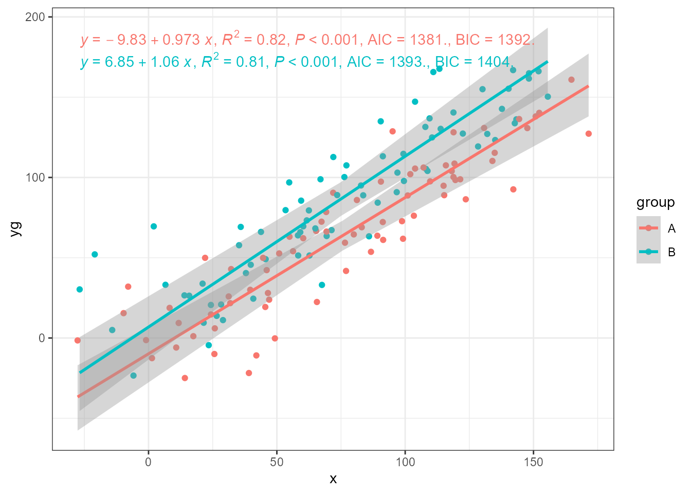
As with ‘lmodel2’, grouping is supported.
ggplot(my.data, aes(x, yg, colour = group)) +
  geom_point() +
  stat_poly_line(method = smatr::ma) +
  stat_poly_eq(method = smatr::ma,
             mapping = use_label("eq", "R2", "P", "AIC", "BIC")) +
  expand_limits(y = 150)
#> SMA/MA, band is currently for slope only!
#> SMA/MA, band is currently for slope only!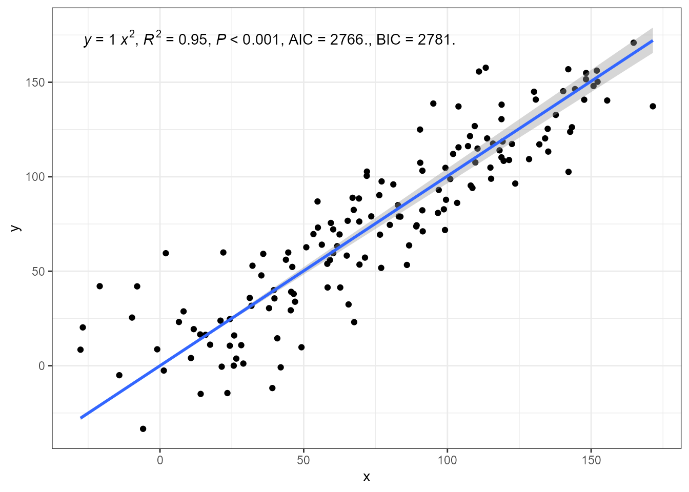
Major axis regression through the origin is supported by ‘smatr’.
ggplot(my.data, aes(x, y)) +
  geom_point() +
  stat_poly_line(method = smatr::ma, formula = y ~ x - 1) +
  stat_poly_eq(method = smatr::ma,
                 formula = y ~ x - 1,
             mapping = use_label("eq", "R2", "P", "AIC", "BIC")) +
  expand_limits(y = 150)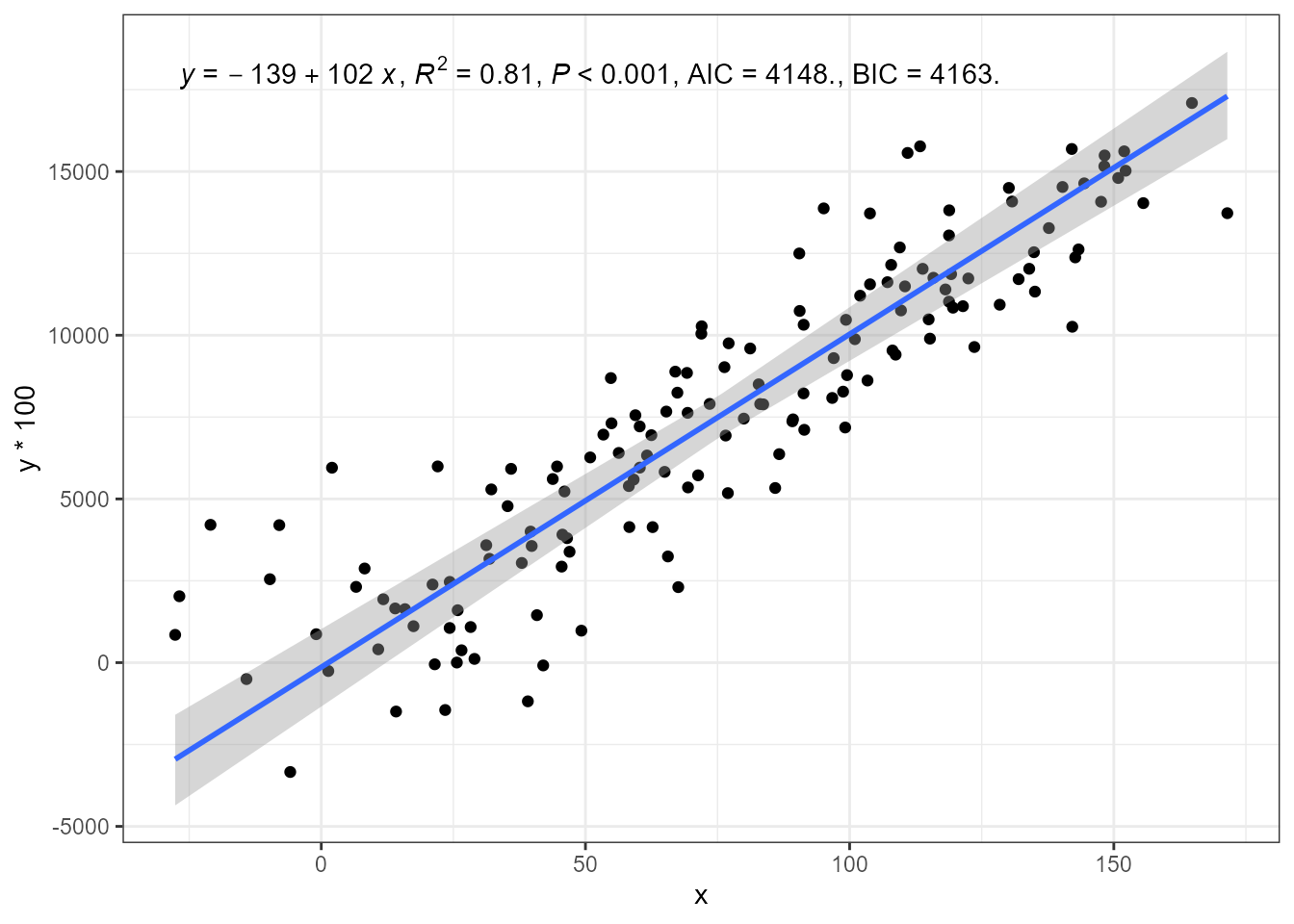
Standardised major axis regression (SMA) is also supported.
ggplot(my.data, aes(x, y * 100)) +
  geom_point() +
  stat_poly_line(method = smatr::sma) +
  stat_poly_eq(method = smatr::sma,
             mapping = use_label("eq", "R2", "P", "AIC", "BIC")) +
  expand_limits(y = 150)
#> SMA/MA, band is currently for slope only!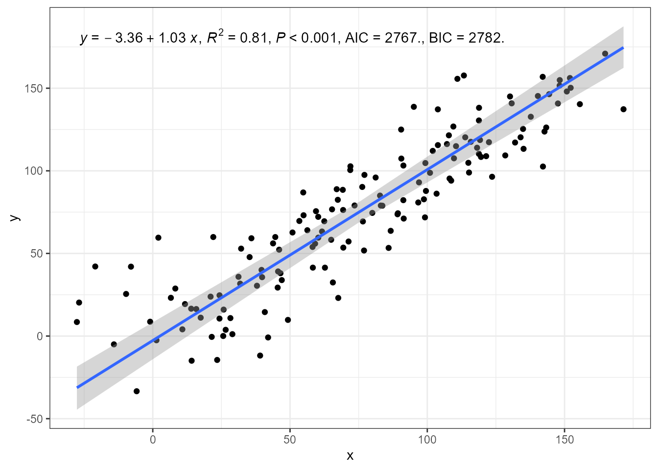
As with LM fits with lm() level of significance of the
confidence band of the regression line can be set by passing an argument
to parameter level. Below, two different values for
level result in bands of different widths.
ggplot(my.data, aes(x, y)) +
  geom_point() +
  stat_poly_line(method = "sma", level = 0.99) +
  stat_poly_line(method = "sma", level = 0.80) +
  expand_limits(y = 150)
#> SMA/MA, band is currently for slope only!
#> SMA/MA, band is currently for slope only!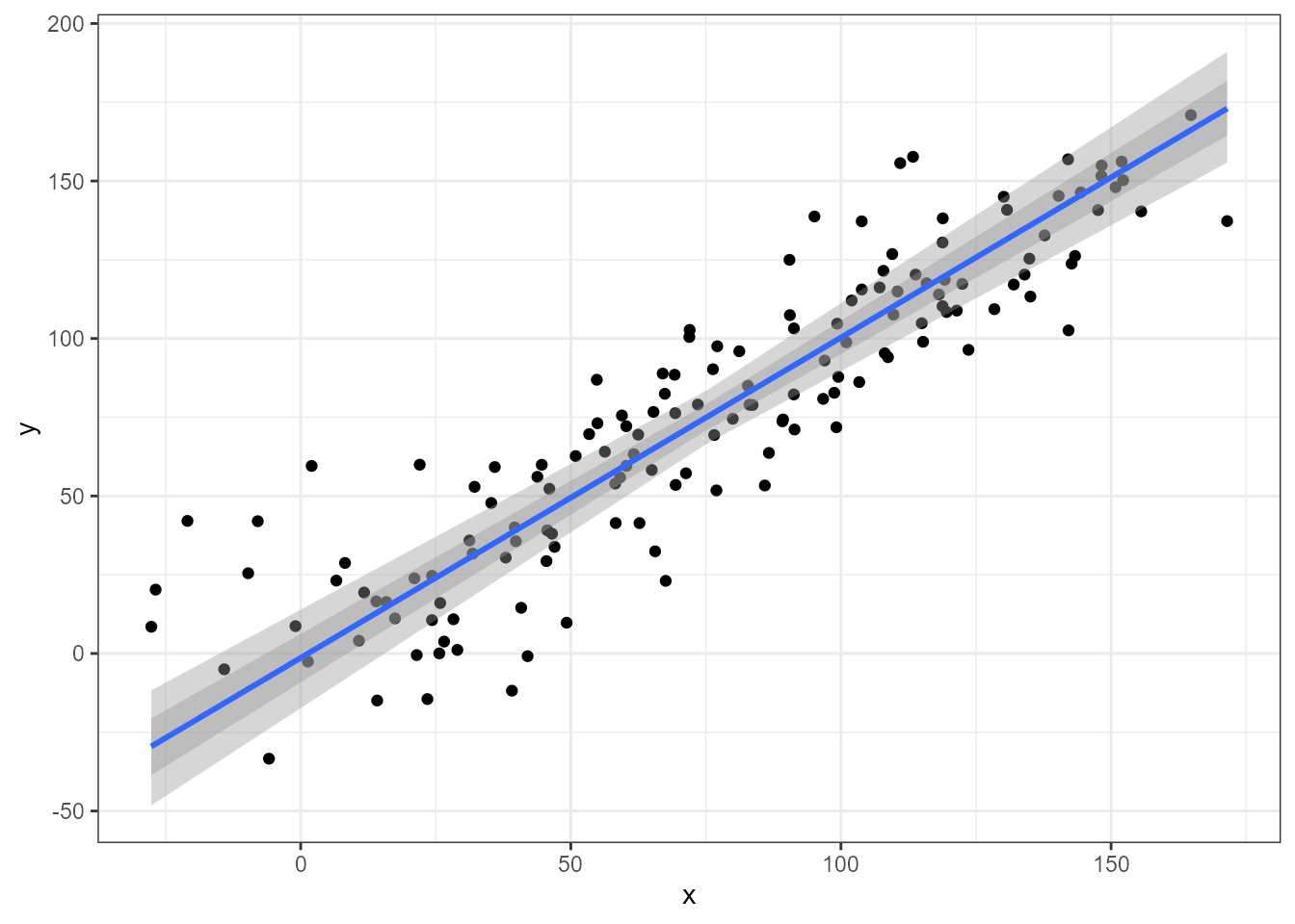
A robust estimation method can be enabled by passing an argument to
be forwarded to the the model fit function, in this case
sma() or ma().
ggplot(my.data, aes(x, y)) +
  geom_point() +
  stat_poly_line(method = "sma", method.args = list(robust = TRUE)) +
  stat_poly_eq(method = "sma", method.args = list(robust = TRUE),
             mapping = use_label("eq", "R2", "P", "AIC", "BIC")) +
  expand_limits(y = 150)
#> SMA/MA, band is currently for slope only!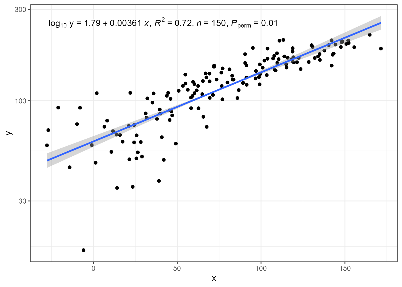
Caveats
The same caveats as for stat_ma_eq() and
stat_ma_line() apply. In addition:
The plotted confidence band does not take into account the uncertainty of the intercept estimate, only the slope.
Currently labels for F-value or R^2_\mathrm{adj} are not available when using ‘smatr’ together with
stat_poly_eq().Attempts to pass invalid model formulas will trigger errors within ‘smatr’ code.
When applying a log10 transformation in the call to
smatr::sma, the estimates are not back-transformed and consequently, currently this way of applying transformations is not supported.
New data for prediction
Like in stat_mooth() from ‘ggplot2’, parameter
fullrange in stat_poly_line(),
stat_quant_line(), stat_quant_band() and
stat_ma_line() can be used to switch between prediction
based on the range of the explanatory variable data or based on the
limits of the scale of the corresponding aesthetic. Meanwhile,
n controls the number of equally spaced points at which the
prediction will be computed. In most use cases these two alternatives
are enough.
In ‘ggpmisc’ (>= 0.7.1) the new limit.to parameter
provides finer control. Please, see examples in the article Custom Polynomial Models.
Transformations and eq.label
In ‘ggplot2’ setting transformations in x and y
scales results in statistics receiving transformed data as input. The
data “seen” by statistics is the same as if the transformation had been
applied within a call to aes(). However, the scales
automatically adjust breaks and tick labels to display the values in the
untransformed scale. When the transformation is applied in the model
formula definition, the transformation is applied later,
but still before the model is fit. In all these cases, the model fit is
based on transformed values and thus the estimates refer to them. This
is why, a linear fit remains linear in spite of the transformations.
Only eq.label is affected by transformations in the
sense that the x and y in the default equation refer
to transformed values, rather than those shown in the tick labels of the
axes, i.e., the default model equation label is incorrect. The
correction to apply is to override the x and/ir y
symbols in the equation label by an expression that includes the
transformation used.
The code below, using a transformed scale for y, differs
from earlier examples in that pass
eq.with.lhs = "log[10]~y~=~" in the call to
stat_ma_eq() to replace the left-hand-side of the equation.
By default equations are encoded as R’s plotmath expressions, requiring
a special syntax as described in help(plotmath).
ggplot(my.data, aes(x, y + 50)) +
  geom_point() +
  stat_ma_line() +
  stat_ma_eq(mapping = use_label("eq", "R2", "n", "P"),
             eq.with.lhs = "log[10]~y~`=`~") +
  scale_y_log10(name = "y")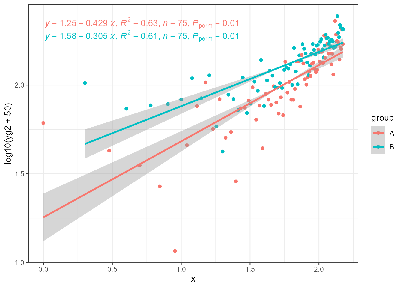
The estimates of slopes for different groups can be different, and
usually will be in the case of real data. Here, it is also possible to
see that if one applies the transformation in the call to
aes() then the tick labels show transformed data values and
the default equation matches them, but the axis label shows the
transformation and the equation does not. They must be made to match by
replacing x in the equation or replacing the axis label (as shown
below).
ggplot(my.data, aes(log10(x0), log10(yg2 + 50), colour = group)) +
  geom_point() +
  stat_ma_line(method = "OLS") +
  stat_ma_eq(method = "OLS",
             mapping = use_label("eq", "R2", "n", "P")) +
  labs(x = "x")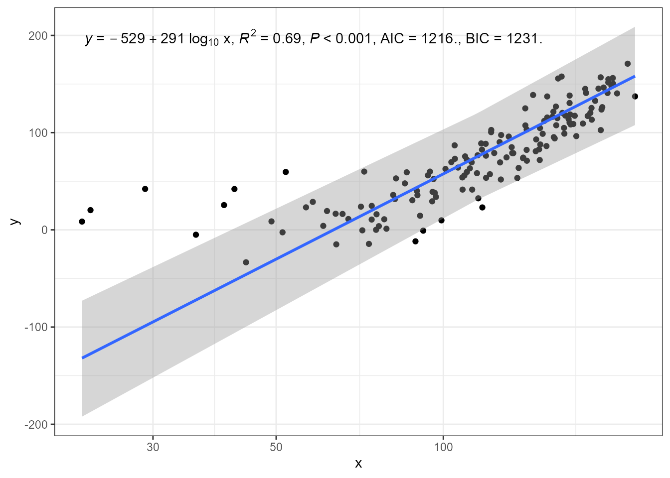
In this last example, the x symbol in the equation is replaced by the transformed x.
ggplot(my.data, aes(x + 50, y)) +
  geom_point() +
  stat_poly_line(method = "sma", method.args = list(robust = TRUE)) +
  stat_poly_eq(method = "sma", method.args = list(robust = TRUE),
             mapping = use_label("eq", "R2", "P", "AIC", "BIC"),
             eq.x.rhs = "~log[10]~x") +
  expand_limits(y = 150) +
  scale_x_log10(name = "x")
#> SMA/MA, band is currently for slope only!